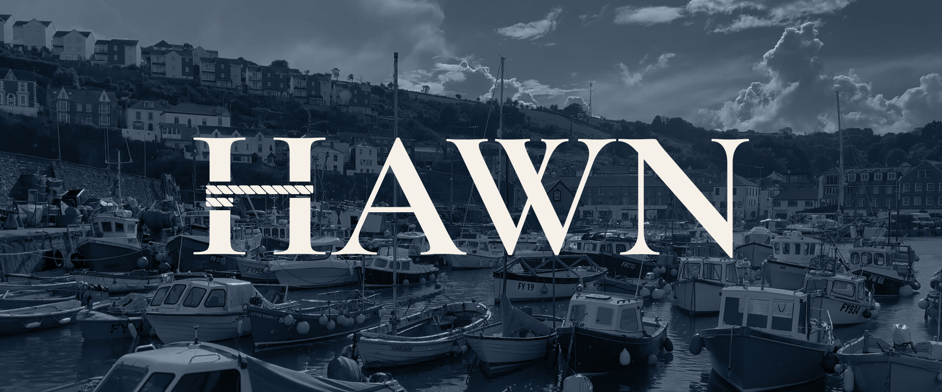
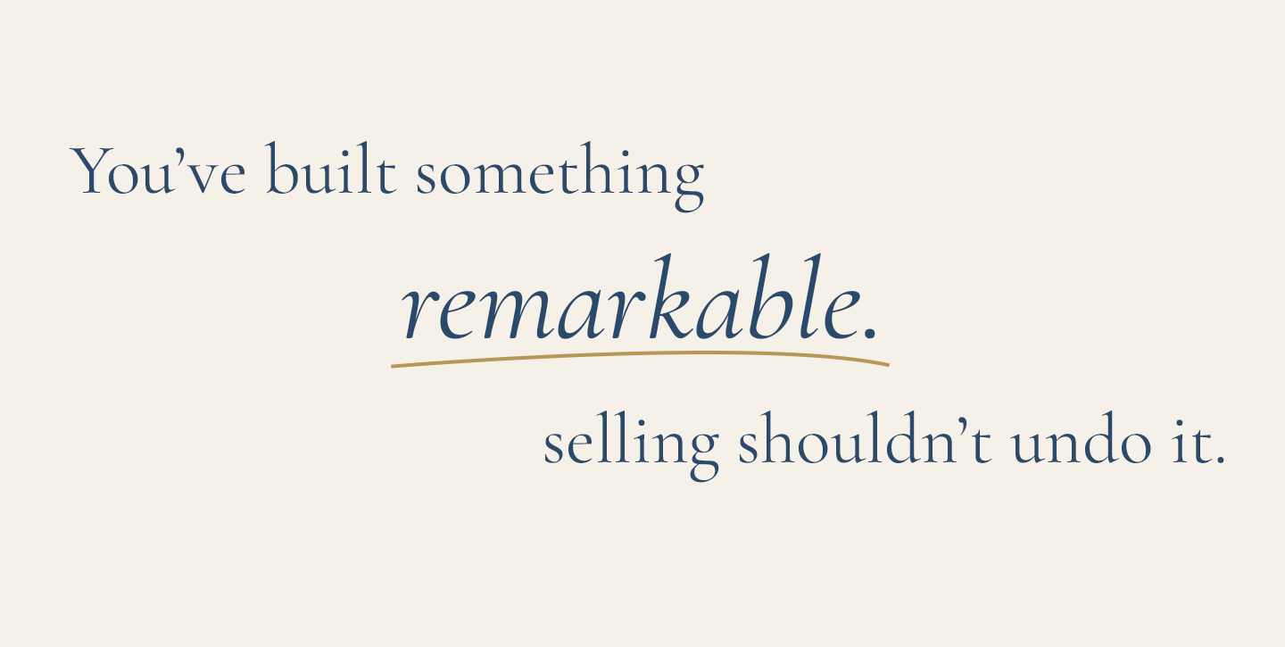
Hawn Holdings is a UK permanent capital firm acquiring owner-managed businesses with operating profits of £500k–£2m. The brief was to create a complete brand identity for a new firm entering a crowded, trust-sensitive market. Leaning into the heritage of the founder to help bring personality.
Client
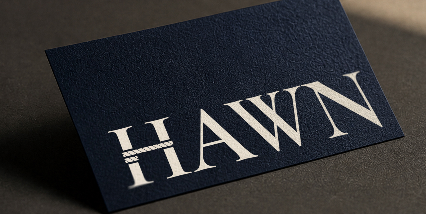
Hawn Holdings
Hawn Holdings
Project Specifics
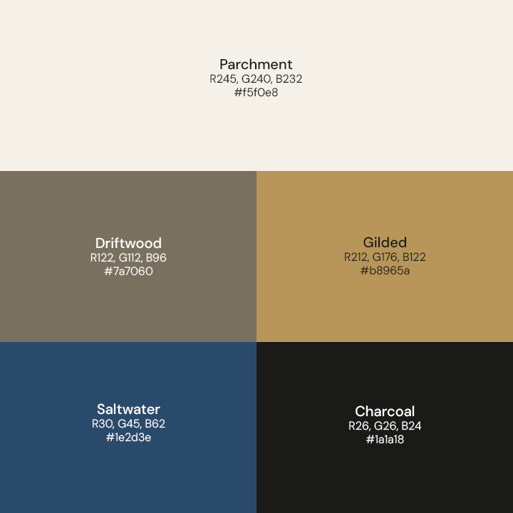
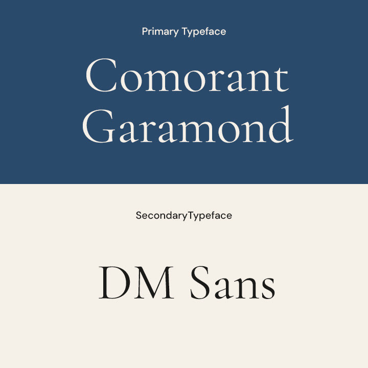
Branding
Branding
Sketches
The Problem
The audience, business owners considering selling their life's work, is deeply mistrustful of private equity. For a new firm with no reputation, design had to do the trust-building that track record couldn't yet.
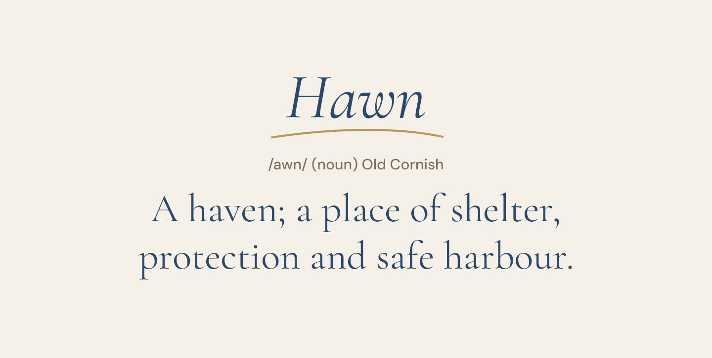
Define: HAWN
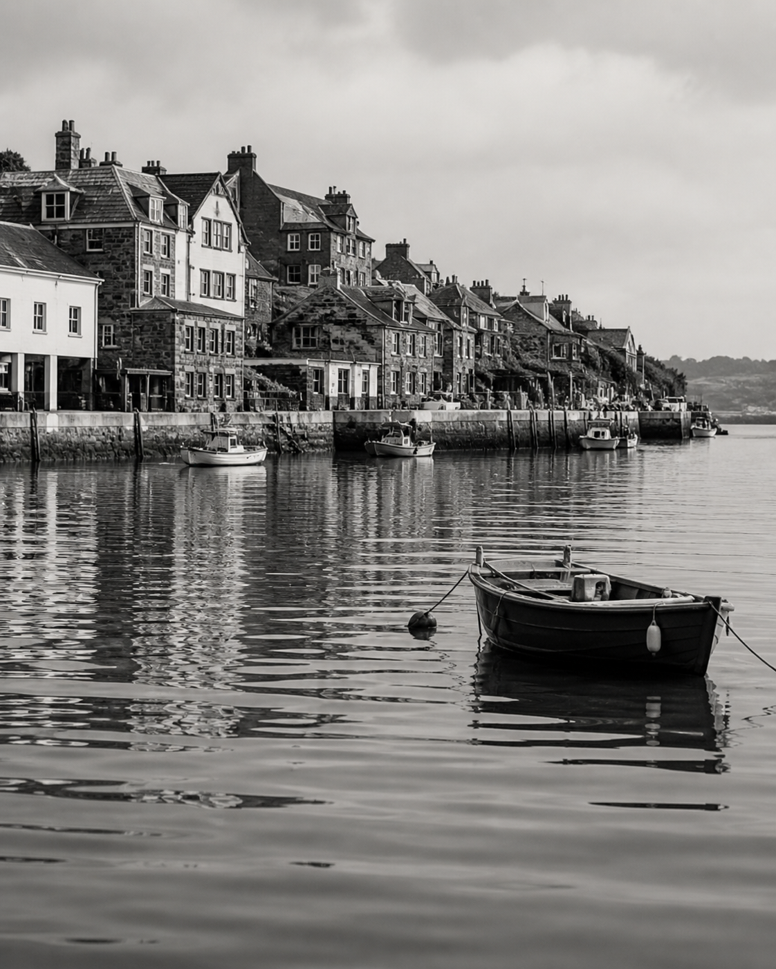
Hawn derives Cornwall, England. This became the strategic foundation for everything: the photography direction, the palette, the tone of voice, and the core brand idea of shelter and permanence. It gave the brand genuine mythology and identity to draw from rather than invented positioning.
The execution
Rooted in the etymology of the name, every element was designed to feel permanent — warm enough to earn trust, considered enough to last.
Visual Language
reliability

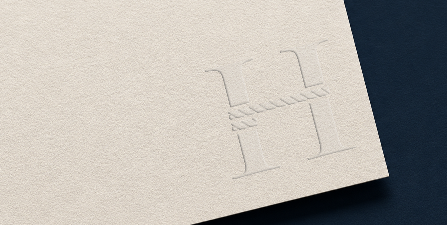
Iconography
Website
Designed for a high-consideration audience making one of the most significant financial decisions of their lives — restrained in its CTAs, deliberate in its pacing, and structured around a content strategy that addresses the seller's emotional concerns before making any commercial argument. Sections move the reader from recognition of their situation, through trust-building, to a low-pressure invitation to start a conversation.
Website mock ups here
Include some other Deliverables here